One typeface
does it all
I used Inter for the entire experience. Its clear letterforms hold up in both oversized statements and small labels; its numerals keep applications, prices and countdowns easy to scan.
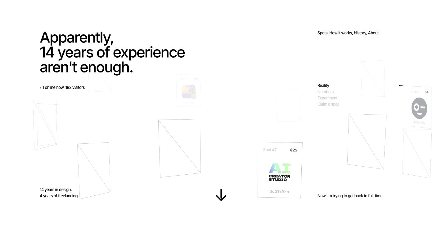
Spots is a live experiment shaped by my job search, where the story and the interaction are part of the same experience.
(Scroll to learn more)(Swipe to learn more)
The search
In May 2026, after years of freelance work, I decided to look for a full-time product design role. I gave each application attention, yet the time I invested was often met with little clarity about what would happen next. It is an experience many designers and developers share, but rarely make public.
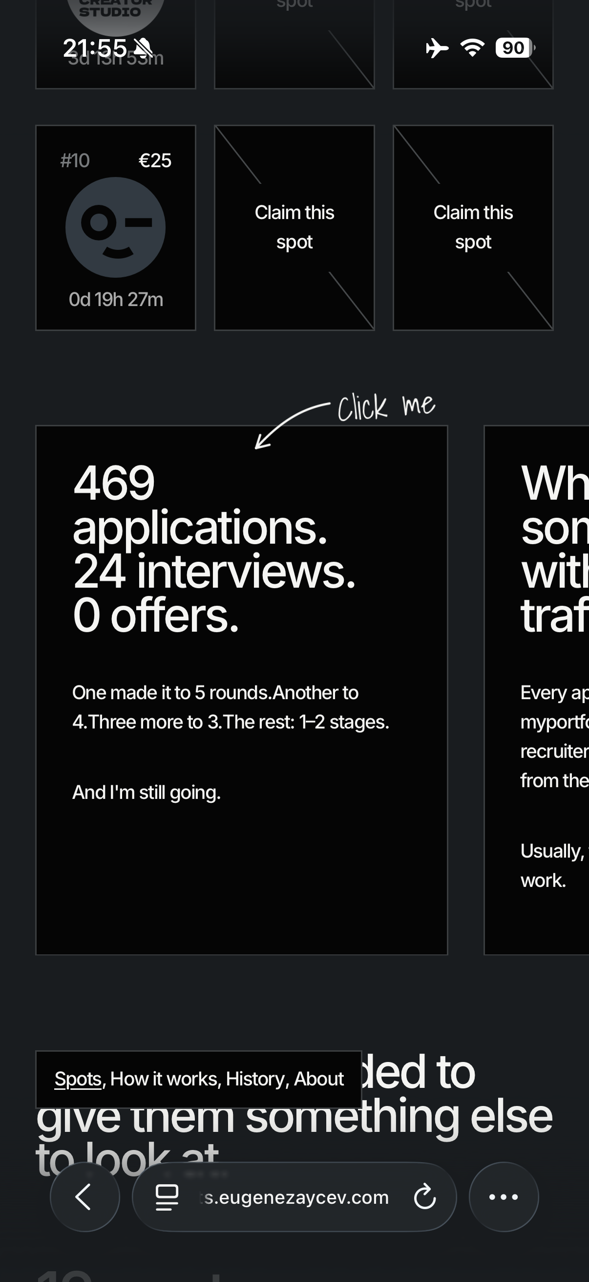
By the time I began Spots, I had sent 412 applications and completed 24 interviews. For one role, I went through five interview rounds before the company paused hiring. For another, I completed four rounds before receiving a standard rejection. Three other roles reached a third round; the remaining opportunities ended after one or two interview rounds.
Challenge
The challenge was not to redesign another portfolio. It was to create a reason for people to stay, interact and remember – while keeping the job-search story honest.
The concept had to communicate design craft immediately, explain itself without onboarding, and remain credible as a real product with pricing, moderation and a finite lifecycle.
Design system
I kept the interface almost monochrome so the message, the empty positions and the people who claim them stay in focus.
The visual system is intentionally restrained. Thin borders give each of the 12 spots a clear boundary, while the small green live indicator is used only where attention is needed. Everything else stays neutral and lets the content do the work.
I used Inter for the entire experience. Its clear letterforms hold up in both oversized statements and small labels; its numerals keep applications, prices and countdowns easy to scan.
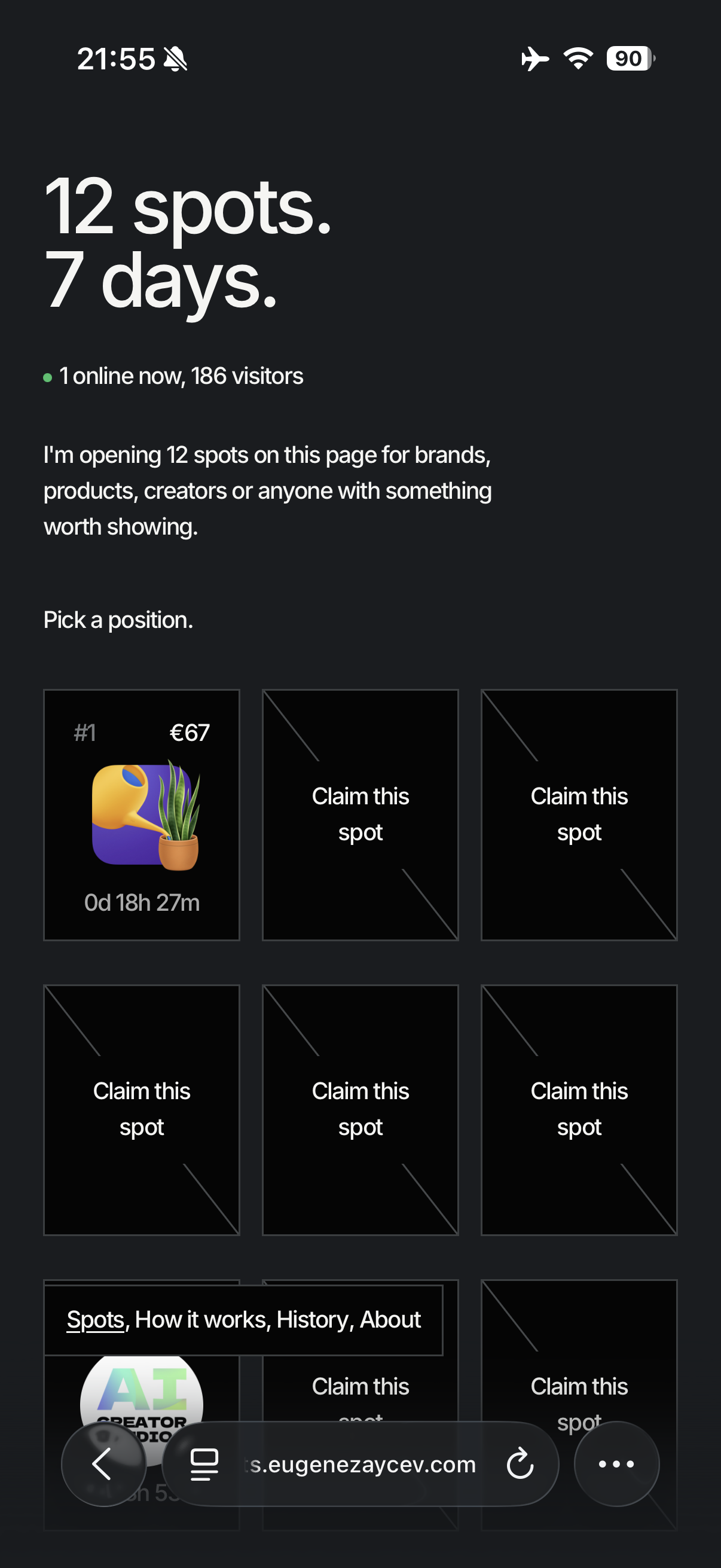
The 12 spots move around the ring on desktop, then adapt into a horizontal grid on mobile. The structure changes, but the system stays the same.
Light and dark modes share the same hierarchy, borders and card behavior. The reversal changes the mood, while preserving the interaction model and keeping claimed logos distinct.
Interaction
Movement helps visitors see what is available, what is changing and where to look next. It makes the page feel active while keeping the story readable.
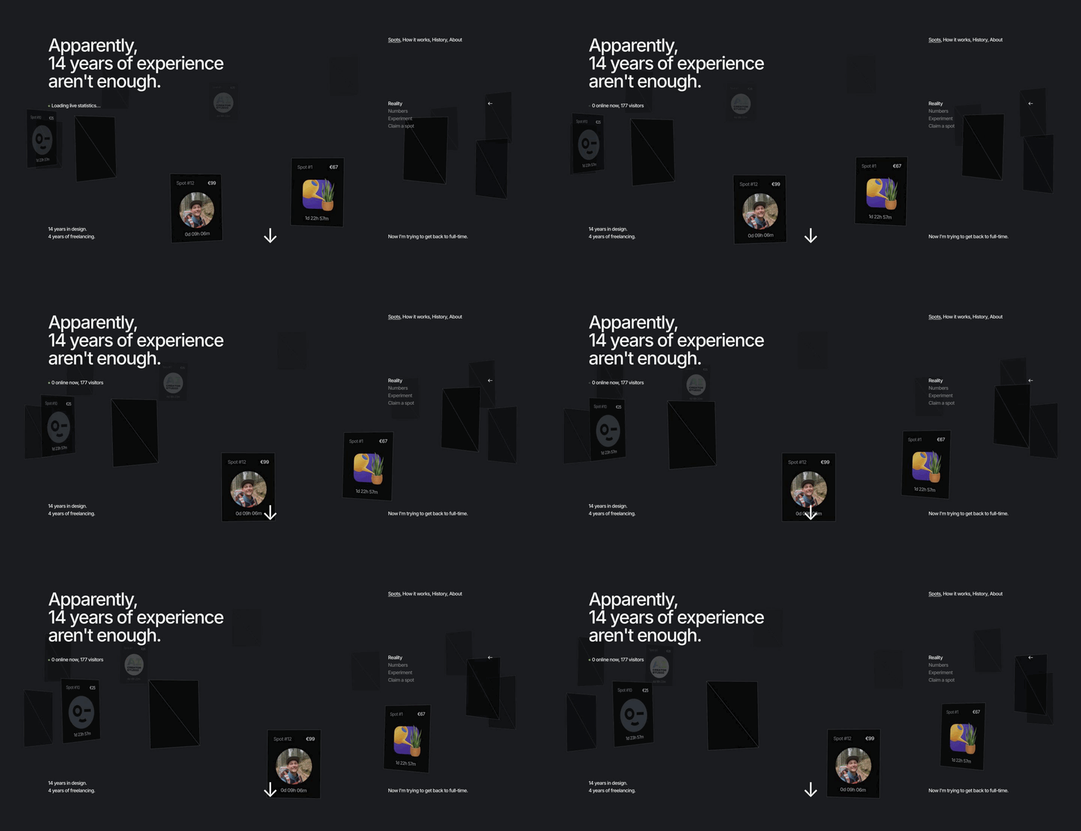
Cards move through a shared orbit, turning twelve separate placements into one living system.
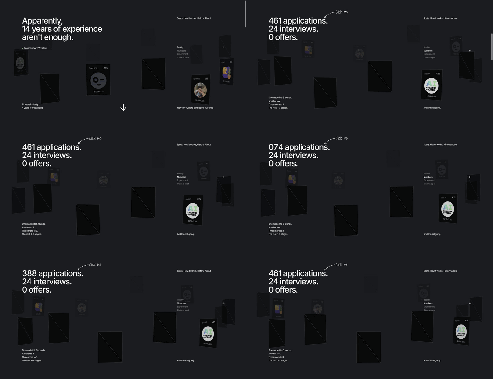
The number rolls into place instead of appearing instantly, making accumulated effort feel measurable.
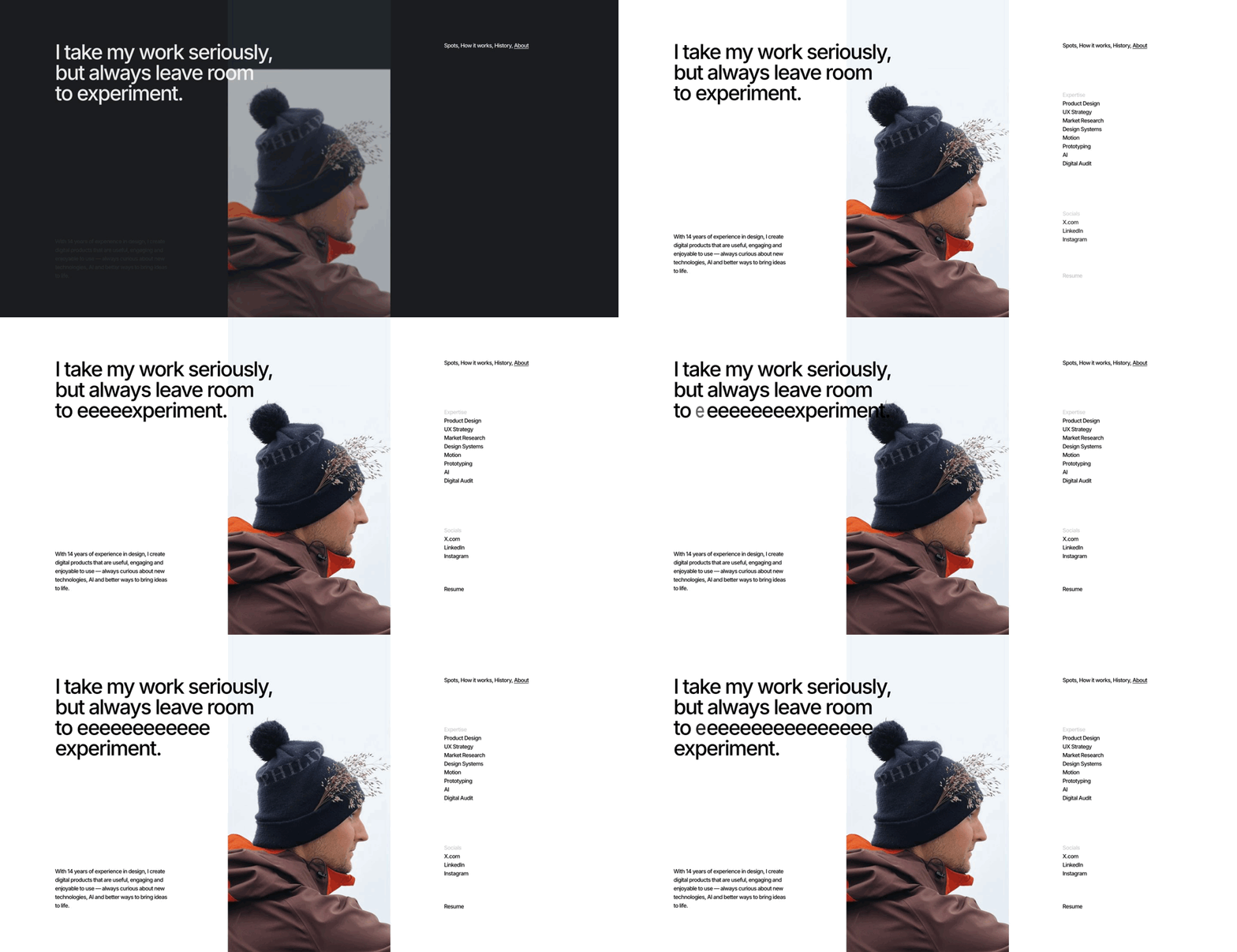
Hovering the headline stretches the word “experiment,” adding an expressive response at the moment the copy invites curiosity.
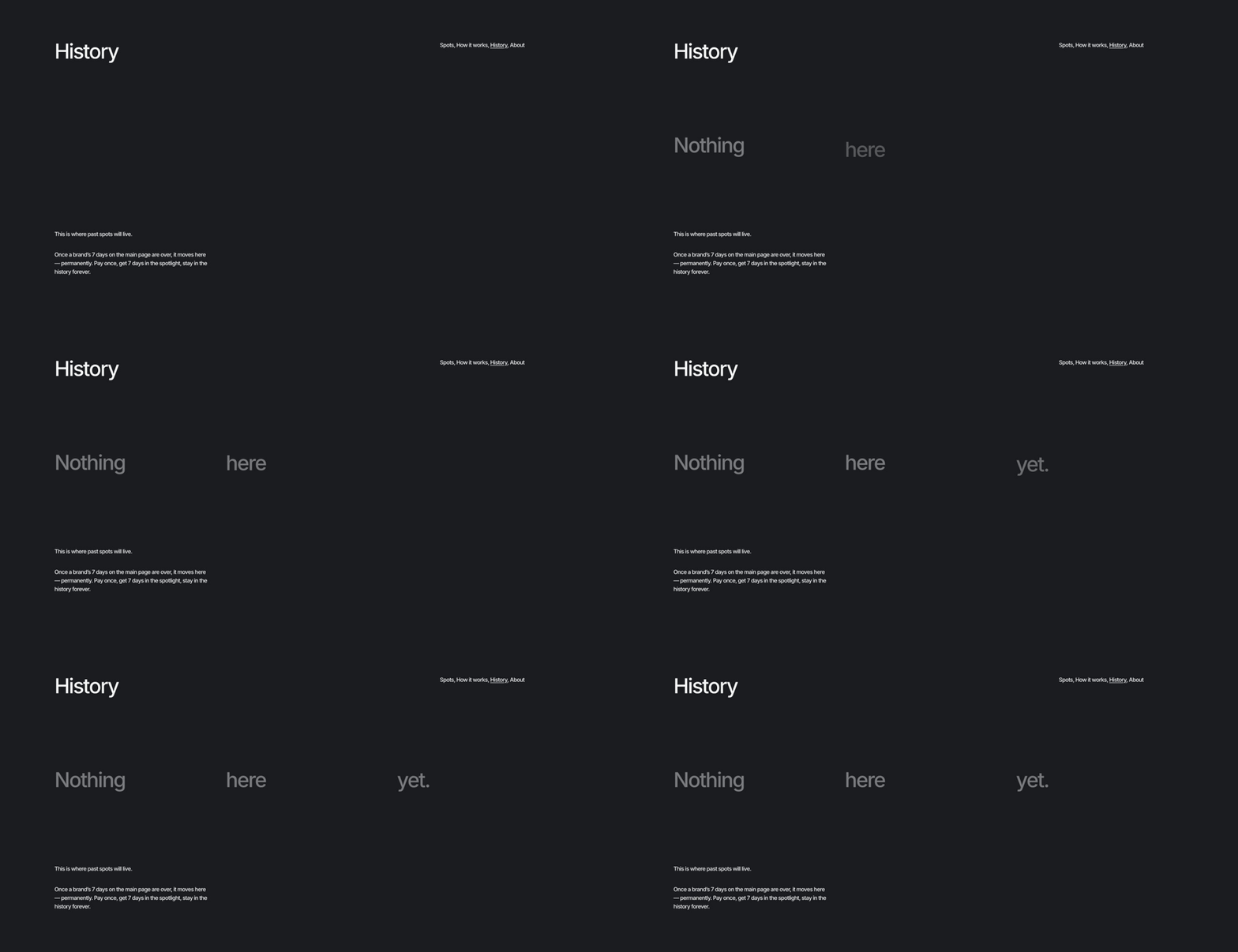
“Nothing here yet” appears in sequence, drawing attention to the space reserved for past spots.
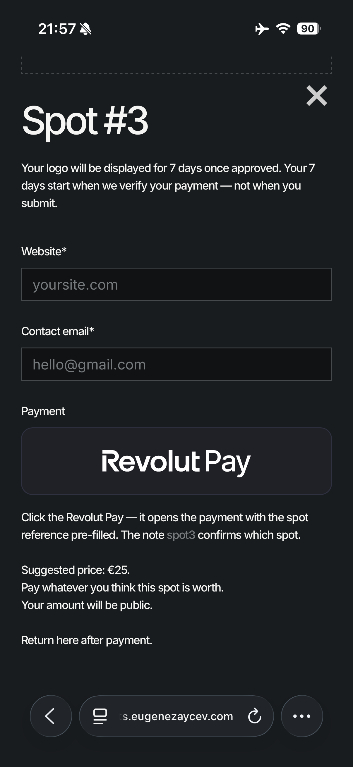
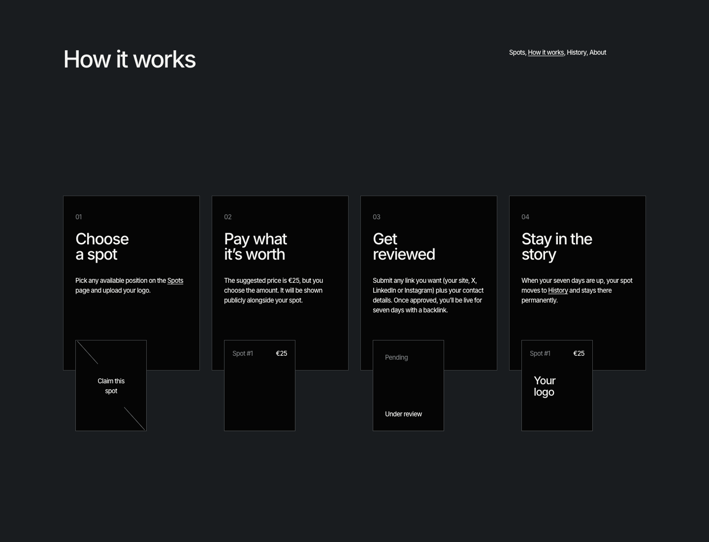
On mobile, spots appear 3 per row, so visitors can scan them as they scroll. The job-search story follows beneath the grid in dedicated blocks. Selecting a spot opens a claim form with the seven-day term, website and contact fields, and a Revolut Pay button with payment instructions.
Product decisions
The ideal payment flow was Stripe. In practice, I did not have a company, while alternatives such as Lemon Squeezy and Paddle introduced merchant review and approval steps that did not fit a fast, personal experiment.
I chose Revolut as the pragmatic route. The trade-off was less automation, but it let the core proposition ship. Manual review became an intentional trust layer: every submission is checked before it appears, protecting both the audience and the page.
Outcome
Spots transformed a personal job search into a launched product: a distinct concept, a clear interaction model, responsive behavior and a real operational flow.
Ploi became the first supporter, claiming Spot #1 for €67. It was the first sign that the story resonated beyond my own job search — someone saw the idea, connected with it and chose to support it.
The broader outcome is proof of how I approach ambiguous product problems: start from lived behavior, find a memorable mechanic, reduce it to understandable steps, and make pragmatic calls when the ideal infrastructure is unavailable.


